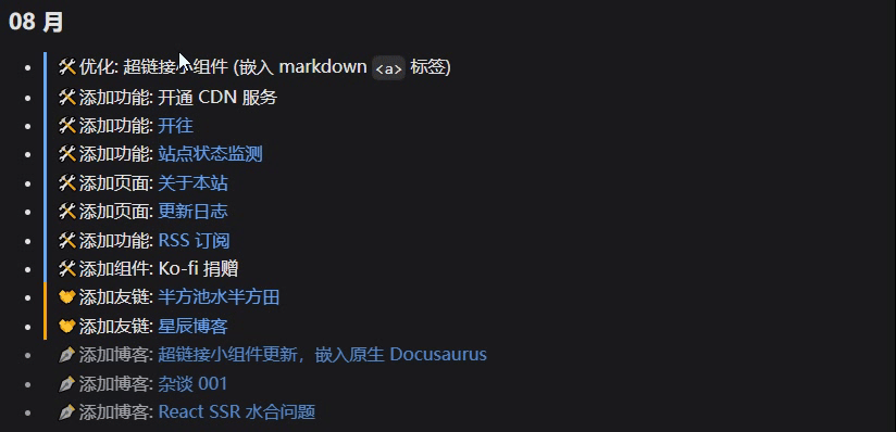
超链接小组件更新,嵌入原生 Docusaurus

这次更新制作了一个悬浮窗动画效果,可以根据链接的不同类型渲染不同样式。其次是将部分功能封装,并嵌入了 Docusaurus 的 mdx <a> 标签,就可以在 markdown 文件中,使用 [text](url) 语法来调用
并且放到了 Github站外链接 上,欢迎大家使用和二创
缘起
在翻看 @wuanqin站外链接 的博客时,发现博主的超链接,会有一个悬浮的小框,显示外链/内链

顺带还有些功能也想实现,以及重构代码,就一起搞了
悬浮框
做这个悬浮框分两部分,一个是样式,一个是区分内外链接
内外链接判断
笔者把引用的链接分为了三种:
- 站外链接
- 站内文章
- 页面内跳转
页面内跳转是,比如从 /blog/Link-update-2025-08 跳转到 /blog/Link-update-2025-08#内外链接判断,即跳到当前页面内的某一 part
站外文章最好判断,不以 / 开头的都算,其他就属于站内文章。判断是否是页面内跳转比较麻烦,首先判断链接内是否有 #;然后把 # 及之后的内容去掉,和当前路径做对比
import { useLocation } from "@docusaurus/router";
const currentPath = useLocation().pathname;

const isExternalLink = !href.startsWith("/");
const isAnchorLink = href.includes("#") && href.split("#")[0] === currentPath;
但这样在 Docusaurus 中会有一个问题,useLocation 返回的是包括 i18n 在内的路径,也就是类似 /en/blog/ 这种,而我们在 markdown 里的路径就是一个纯净路径,是 Docusaurus 的多语言支持给我们正确添加 i18n 的
这部分是 Docusaurus 的 @docusaurus/Link 组件的功能
举个栗子,如果使用 [超链接小组件](/blog/Link) 这样的语法,那么在英文版,会自动给我们添加 /en 的前缀跳转,这样避免语言间的混乱。但文中的 href 还是原始的 /blog/Link
所以笔者自制了一个 hook,用于在 Docusaurus 中获取当前的纯净路径。其实也不复杂,就是区别 defaultLocale 和 其他 Locale 的情况
import { useLocation } from "@docusaurus/router";
import useDocusaurusContext from "@docusaurus/useDocusaurusContext";

export function usePlainLocation(): string {
  const { i18n } = useDocusaurusContext();
  const currentPath = useLocation().pathname;

  if (i18n.currentLocale === i18n.defaultLocale) {
    return currentPath;
  }

  const localePrefix = `/${i18n.currentLocale}`;
  if (currentPath.startsWith(localePrefix)) {
    const plainPath = currentPath.slice(localePrefix.length);
    return plainPath || "/";
  }

  return currentPath;
}
然后这样用就可以了
import { usePlainLocation } from "@site/src/hooks/usePlainLocation";
const currentPath = useLocation().pathname;

const isExternalLink = !href.startsWith("/");
const isAnchorLink =
  href.includes("#") && href.split("#")[0] === usePlainLocation();
悬浮框样式
想做一个类似聊天气泡,下面有个小尖尖那种,一点点来
基础样式
先让他显示出来:通过外层的 relative 来定位这个链接的宽度,再在中间显示出来,一个圆角矩形+一个小啾啾
return (
  <span className="tailwind">
    <span className="relative inline-block">
      一个链接
      <LinkBadge />
    </span>
  </span>
);
LinkBadge
import React from "react";
const LinkBadge: React.FC = () => {
  return (
    ...
    <span
      className={classNames({
        "absolute -top-8 left-1/2 transform -translate-x-1/2": true,
        "px-2 py-1 text-xs rounded shadow-lg": true,
        "pointer-events-none": true,
        "whitespace-nowrap": true,
        "text-white": true,
        "bg-orange-500": true,
      })}
    >
      站外链接
      <span
        className={classNames({
          "absolute top-full left-1/2 transform -translate-x-1/2": true,
          "border-l-4 border-r-4 border-t-4": true,
          "w-0 h-0": true,
          "border-transparent": true,
          "border-t-orange-500": true,
        })}
      />
    </span>
    ...
  );
};

export default LinkBadge;
渲染不同种类链接内容
第二步,根据不同类型的链接,渲染不同内容。把之前获取的 isExternalLink, isAnchorLink 传入
  import React from "react";
+ interface LinkBadgeProps {
+   isExternalLink: boolean;
+   isAnchorLink: boolean;
+ }

- const LinkBadge: React.FC = () => {
+ const LinkBadge: React.FC<LinkBadgeProps> = ({
+   isExternalLink,
+   isAnchorLink,
+ }) => {
    return (
      ...
      <span ... >
-       站外链接
+       {isExternalLink && 站外链接}
+       {isAnchorLink && 页面内跳转}
+       {!isExternalLink && !isAnchorLink && 站内文章}
        <span ... />
      </span>
      ...
    );
  };

  export default LinkBadge;
上色
第三步给不同类型的链接加上不同的颜色
为了方便之后加新的类型,将颜色放到一个单独的 color.ts 中
interface BadgeColorScheme {
  badgeColor: string;
  arrowColor: string;
}

export const badgeColors: Record<string, BadgeColorScheme> = {
  external: {
    badgeColor: "bg-orange-500",
    arrowColor: "border-t-orange-500",
  },
  internal: {
    badgeColor: "bg-blue-500",
    arrowColor: "border-t-blue-500",
  },
  inpage: {
    badgeColor: "bg-violet-500",
    arrowColor: "border-t-violet-500",
  },
};
然后在组件中使用
+ import { badgeColors } from "./colors";
  ...
  const LinkBadge: React.FC<LinkBadgeProps> = ({
    isExternalLink,
    isAnchorLink,
  }) => {

+ const type: keyof typeof badgeColors = isExternalLink
+   ? "external"
+   : isAnchorLink
+   ? "inpage"
+   : "internal";
+ const { badgeColor, arrowColor } = badgeColors[type];
    return (
      ...
      <span
        className={classNames({
          ...
-         "bg-orange-500": true,
+         [badgeColor]: true,
        })}>
        {isExternalLink && 站外链接}
        {isAnchorLink && 页面内跳转}
        {!isExternalLink && !isAnchorLink && 站内文章}
        <span
          className={classNames({
            ...
-           "border-t-orange-500": true,
+           [arrowColor]: true,
          })}/>
      </span>
      ...
    );
  };

  export default LinkBadge;
添加悬浮效果
在翻看 @wuanqin站外链接 的超链接时,发现他的悬浮效果应该就是单纯的 hover 时 opacity-100 ,不 hover 时 opacity-0。但这个样式会存在一定的割裂感
之前在制作这个超链接组件时,这一章站内文章详细介绍了笔者想要的效果
即:
不管是鼠标快速扫过还是悬浮不动,下划线会先全部拉满,再进行下一步的操作
针对这个悬浮框也一样,不管是鼠标快速扫过,还是悬浮到上面,都会完整地显示一次动画
好消息是,hover 的逻辑之前已经实现过了,直接当一个参数传入用就行
实现逻辑请参考这里站内文章
  ...
  interface LinkBadgeProps {
+   isVisible: boolean;
    isExternalLink: boolean;
    isAnchorLink: boolean;
  }

  const LinkBadge: React.FC<LinkBadgeProps> = ({
+   isVisible,
    isExternalLink,
    isAnchorLink,
  }) => {
    ...

    return (
      <span
        className={classNames({
+         "opacity-0 scale-75": !isVisible,
+         "opacity-100 scale-100": isVisible,
        })}
      >
        ...
      </span>
    );
  };\
i18n
最后把 i18n 加上,对于不知道 docusaurus 的这个功能的朋友,请参考这里站内文章
+ import Translate from "@docusaurus/Translate";
  ...
  const LinkBadge: React.FC<LinkBadgeProps> = ({
    ..
    return (
-     {isExternalLink && 站外链接}
-     {isAnchorLink && 页面内跳转}
-     {!isExternalLink && !isAnchorLink && 站内文章}
+     {isExternalLink && <Translate>站外链接</Translate>}
+     {isAnchorLink && <Translate>页面内跳转</Translate>}
+     {!isExternalLink && !isAnchorLink && <Translate>站内文章</Translate>}
    )
    ...
  )
总之最后封装好的组件代码如下:
LinkBadge
import Translate from "@docusaurus/Translate";
import classNames from "classnames";
import React from "react";
import { badgeColors } from "./colors";
interface LinkBadgeProps {
  isVisible: boolean;
  isExternalLink: boolean;
  isAnchorLink: boolean;
}

const LinkBadge: React.FC<LinkBadgeProps> = ({
  isVisible,
  isExternalLink,
  isAnchorLink,
}) => {
  const type: keyof typeof badgeColors = isExternalLink
    ? "external"
    : isAnchorLink
    ? "inpage"
    : "internal";
  const { badgeColor, arrowColor } = badgeColors[type];

  return (
    <span
      className={classNames({
        "absolute -top-8 left-1/2 transform -translate-x-1/2": true,
        "px-2 py-1 text-xs rounded shadow-lg": true,
        "transition-all duration-300": true,
        "opacity-0 scale-75": !isVisible,
        "opacity-100 scale-100": isVisible,
        "pointer-events-none": true,
        "whitespace-nowrap": true,
        "text-white": true,
        [badgeColor]: true,
      })}
    >
      {isExternalLink && <Translate>站外链接</Translate>}
      {isAnchorLink && <Translate>页面内跳转</Translate>}
      {!isExternalLink && !isAnchorLink && <Translate>站内文章</Translate>}
      <span
        className={classNames({
          "absolute top-full left-1/2 transform -translate-x-1/2": true,
          "w-0 h-0": true,
          "border-l-4 border-r-4 border-t-4": true,
          "border-transparent": true,
          "text-white": true,
          [arrowColor]: true,
        })}
      />
    </span>
  );
};

export default LinkBadge;
嵌入 Docusaurus
笔者想在 markdown 里直接使用 [text](url) 语法来调用这个组件,那就是直接用 swizzle
Swizzle <a>
不知道 Docusaurus swizzle 的朋友可以看这里站外链接
简单来说就是修改 Docusaurus 的系统组件
首先把所有能 swizzle 的组件列出来
npm run swizzle -- --list | grep -i link
| Component | Description |
|---|---|
| Footer/LinkItem | The footer link item component |
| Footer/Links | The footer component rendering the footer links |
| Footer/Links/MultiColumn | The footer component rendering the footer links with a multi-column layout |
| Footer/Links/Simple | The footer component rendering the footer links with a simple layout (single row) |
| MDXComponents/A | The component used to render <a> tags and Markdown links in MDX |
| SkipToContent | The component responsible for implementing the accessibility "skip to content" link (https://www.w3.org/TR/WCAG20-TECHS/G1.html站外链接) |
| BlogPostItem/Footer/ReadMoreLink | N/A |
发现我们要改的是 MDXComponents/A 组件。使用如下命令 swizzle
npm run swizzle @docusaurus/theme-classic MDXComponents/A
会生成 ./src/theme/MDXComponents/A.tsx
import Link from "@docusaurus/Link";
import type { Props } from "@theme/MDXComponents/A";
import React from "react";

export default function MDXA(props: Props): JSX.Element {
  return <Link {...props} />;
}
接下来修改一下组件来适配
组件适配
从上面我们可以看到, Docusaurus Markdown 中的链接,会被渲染为 Docusaurus 的 <Link> 组件,其有以下优点
- 自动检测 url 是否存在(站内 url)
- 链接预加载
- 自动应用 base URL
- 智能添加 target="_blank" rel="noopener noreferrer"
你可以在这里站外链接找到它的详细介绍
但笔者之前的组件是从零开始一点点做的,不太好适配。所以就先把很多内容进行封装,然后分为两支,一个是原有的 Link 组件,完全自定义;另一个是强化了 Docusaurus 的 <Link> 组件,在后面会进行功能对比
首先把 Link 提取出来
import Link from "@docusaurus/Link";
import type { Props } from "@theme/MDXComponents/A";
import React from "react";

const DocusaurusMDXLinkEnhance = (props: Props) => {
  return (
    <span>
      <Link {...props} />
    </span>
  );
};

export default DocusaurusMDXLinkEnhance;
看了一下, 参数只需要 href 来判断内/外链,再研究一下 props,获取出来
...
  const DocusaurusMDXLinkEnhance = (props: Props) => {
+   const { href } = props;

    return (
      <span>
        <Link {...props} />
      </span>
    );
  };
具体封装的过程就不细讲了,总之最终版本如下:
LinkBadge
import Link from "@docusaurus/Link";
import { useColorMode as useDocusaurusColorMode } from "@docusaurus/theme-common";
import { usePlainLocation } from "@site/src/hooks/usePlainLocation";
import type { Props } from "@theme/MDXComponents/A";
import classNames from "classnames";
import React from "react";
import {
  colors,
  LinkBadge,
  UnderlineAnimation,
  useHoverEffect,
} from "./_components";

const DocusaurusMDXLinkEnhance = (props: Props) => {
  if (!props.href) return <Link {...props} />;
  const { href } = props;

  const { hover, leaving, onMouseEnter, onMouseLeave } = useHoverEffect();

  let mode: "dark" | "light";
  try {
    mode = useDocusaurusColorMode().colorMode;
  } catch {
    mode = "dark";
  }

  const color = colors[mode];

  const isExternalLink = !href.startsWith("/");
  const isAnchorLink =
    href.includes("#") && href.split("#")[0] === usePlainLocation();

  return (
    <span className="tailwind" style={{ display: "inline-block" }}>
      <span
        className={classNames({
          "relative inline-block": true,
          [color.main]: true,
          [color.hover]: true,
        })}
        onMouseEnter={onMouseEnter}
        onMouseLeave={onMouseLeave}
      >
        <Link {...props} />

        <LinkBadge
          isVisible={hover}
          isExternalLink={isExternalLink}
          isAnchorLink={isAnchorLink}
        />

        <UnderlineAnimation
          hover={hover}
          leaving={leaving}
          underlineColor={color.underScore}
        />
      </span>
    </span>
  );
};

export default DocusaurusMDXLinkEnhance;
嵌入
然后改一下前面生成的 ./src/theme/MDXComponents/A.tsx,使用我们的组件即可
- import Link from "@docusaurus/Link";
+ import DocusaurusMDXLinkEnhance from "@site/src/components/Link/DocusaurusMDXLinkEnhance";
  import type { Props } from "@theme/MDXComponents/A";
  import React from "react";

  export default function MDXA(props: Props): JSX.Element {
-   return <Link {...props} />;
+   return <DocusaurusMDXLinkEnhance {...props} />;
  }
对比
代码放到了 Github站外链接 上,目前版本为 V1.1。如上面所说,分为两支。一个是原有 Link 组件,很多内容都可以自定义,另一个是 DocusaurusMDXLinkEnhance,仅用于加强 Markdown 中的使用
| 功能 \ 组件 | Link | DocusaurusMDXLinkEnhance |
|---|---|---|
| 各种动画 | ✔️ | ✔️ |
| 设置是否显示悬浮框 | ✔️(默认不显示) | ❌(默认显示) |
| Docusaurus 优化 | ❌ | ✔️ |
| 跳转逻辑自定义 | ✔️ | ❌ |
| 字体字号下划线自定义 | ✔️ | ❌ |
| 添加自定义颜色 | ✔️ | ❌ |
后记
后面可能考虑搞成一个 npm 包,但完了再研究吧